Quick Start
How to build a page from scratch with Harness?
Every site has a unique structure and set of elements, with Harness you're in control, so feel free to add elements and choose a layout that represents your organization. This can be fun so lets unleash your creative self and get this party started!
Layout
Harness website pages have a common set layout with a Header, Body and a Footer.
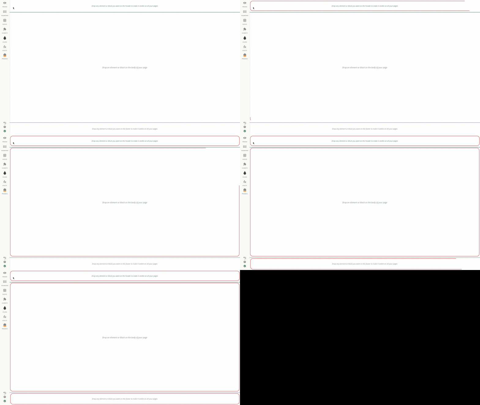
The left panel is where you will find:
the option to Preview how you website currently looks to your audience,
Blocks section, which enables adding designer blocks to your website,
a wide range of site Elements,
Colors tool, to help you make your website more colorful and eye-capturing
a set of Effects, to visually enhance your website along with the
progress bar, that aims at figuring out the steps you should take to make your website more professional and practical.
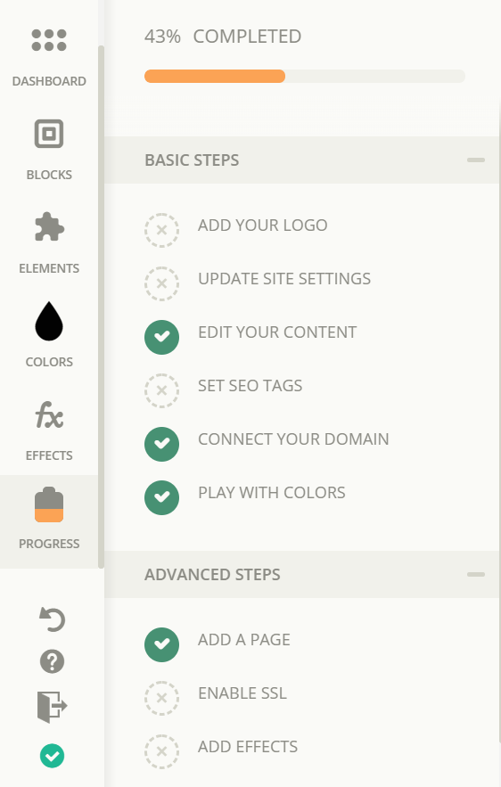
Make sure to check all of the steps from the Progress tab when creating your website ☝😊
Building your own template
As you know, Subbly's website builder is based on drag and drop feature, which means you can simply choose the desired element from the Elements section and drop it wherever you want. Just the same, you can undo the changes made by hitting Ctrl+Z if on Windows or Command+Z if you are a Mac user.
All changes you make to your site are automcaticallyaved once made and so you don't need to save them manually.
When we say that you can drop your elements wherever you want on blank canvas, we mean that. 😊It's as simple as hovering over the preferable block and checking the grey line indicating the space the elements can be placed.
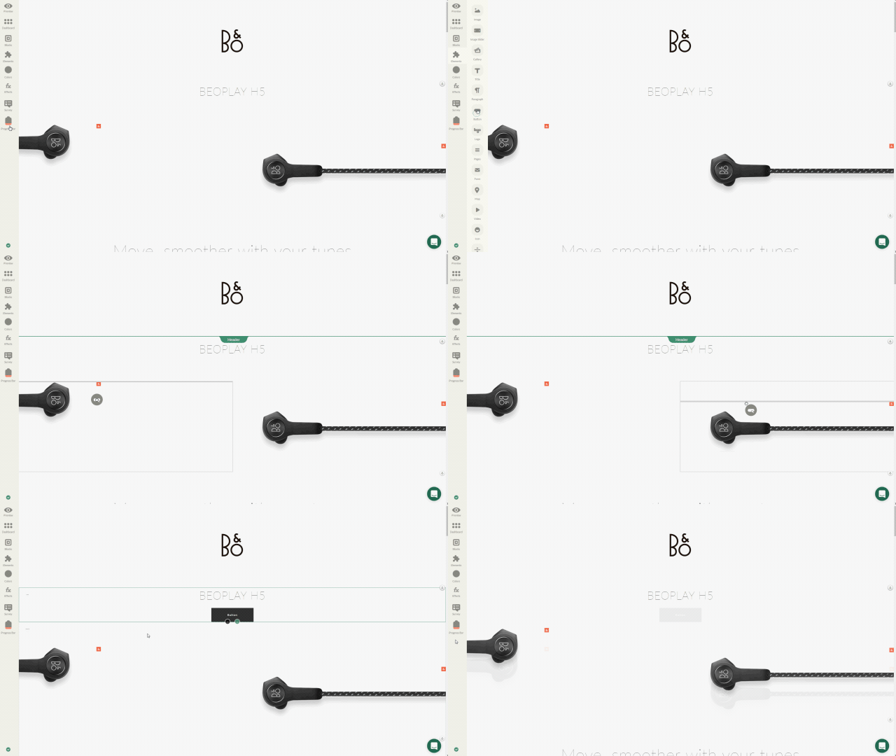
The elements can be set both in full width or grid width, that is to say occupy the whole screen or just the central part of your page respectively.
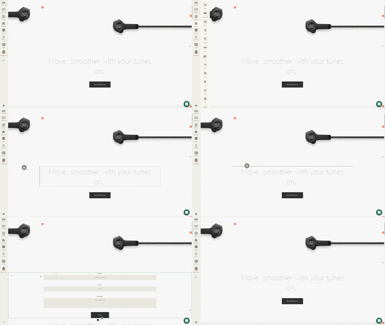
You can also drag the element in the grid width position to full width and back using the pointer.
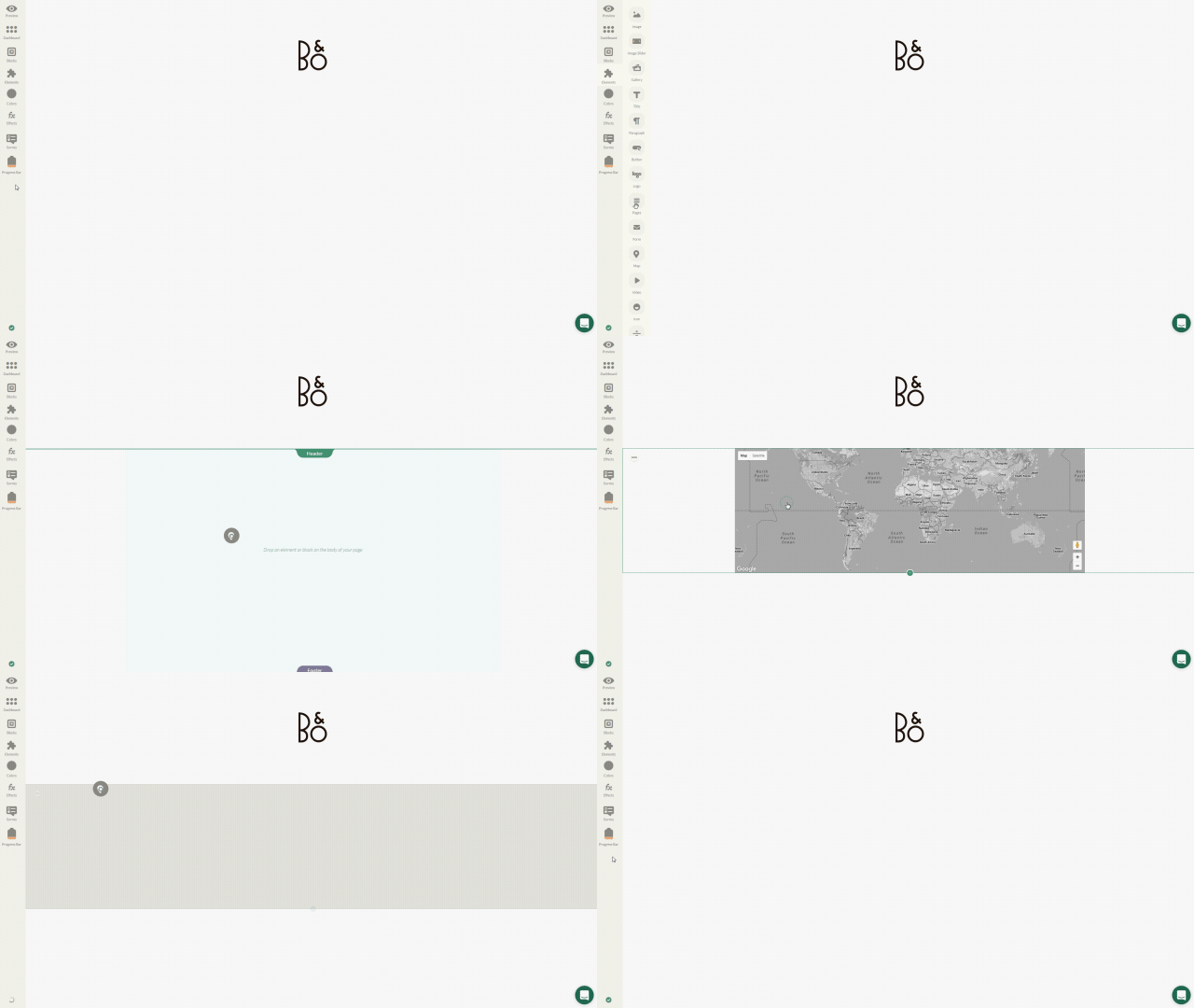
Once you’ve picked the element, move it throughout the canvas area and hold for a while to notice the lines.
You are allowed to place a maximum of 4 elements in a row. 👇
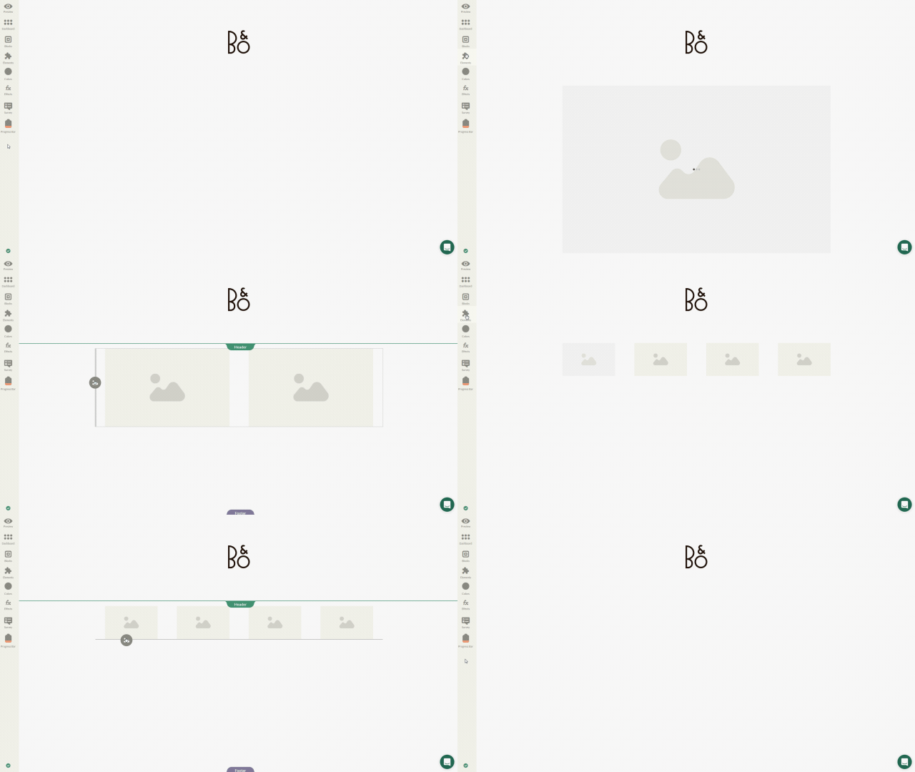
To have the elements in the center of your block, in other words in grid width, just move them to the central part and you’ll notice a grey line indicating where you can place them.
If you want a particular element to stand in full width, drop the desired element to the very right ➡ or left ⬅ side.
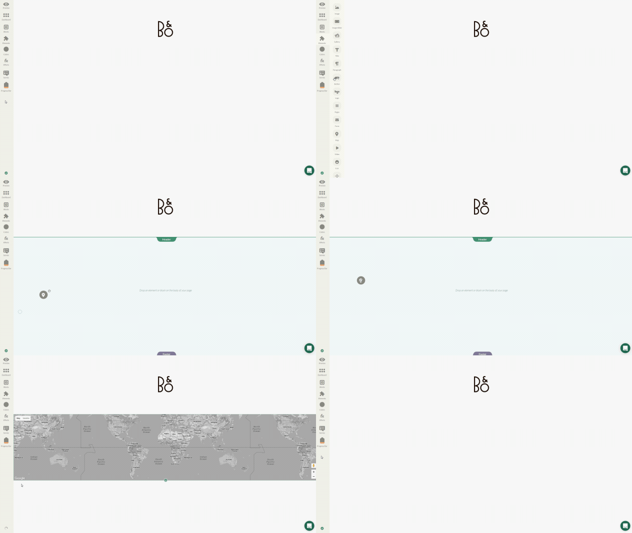
Header & Footer
Let us have a closer look at headers and footers, that play significant roles in the visual impact your website leaves on your site's visitors.
Wisely chosen and arranged blocks are not only eye-capturing, but are also pretty functional. For instance, you can place such important elements like your website logo or your site navigation in your Header or add your contact info, subscription form along with social icons to the Footer.
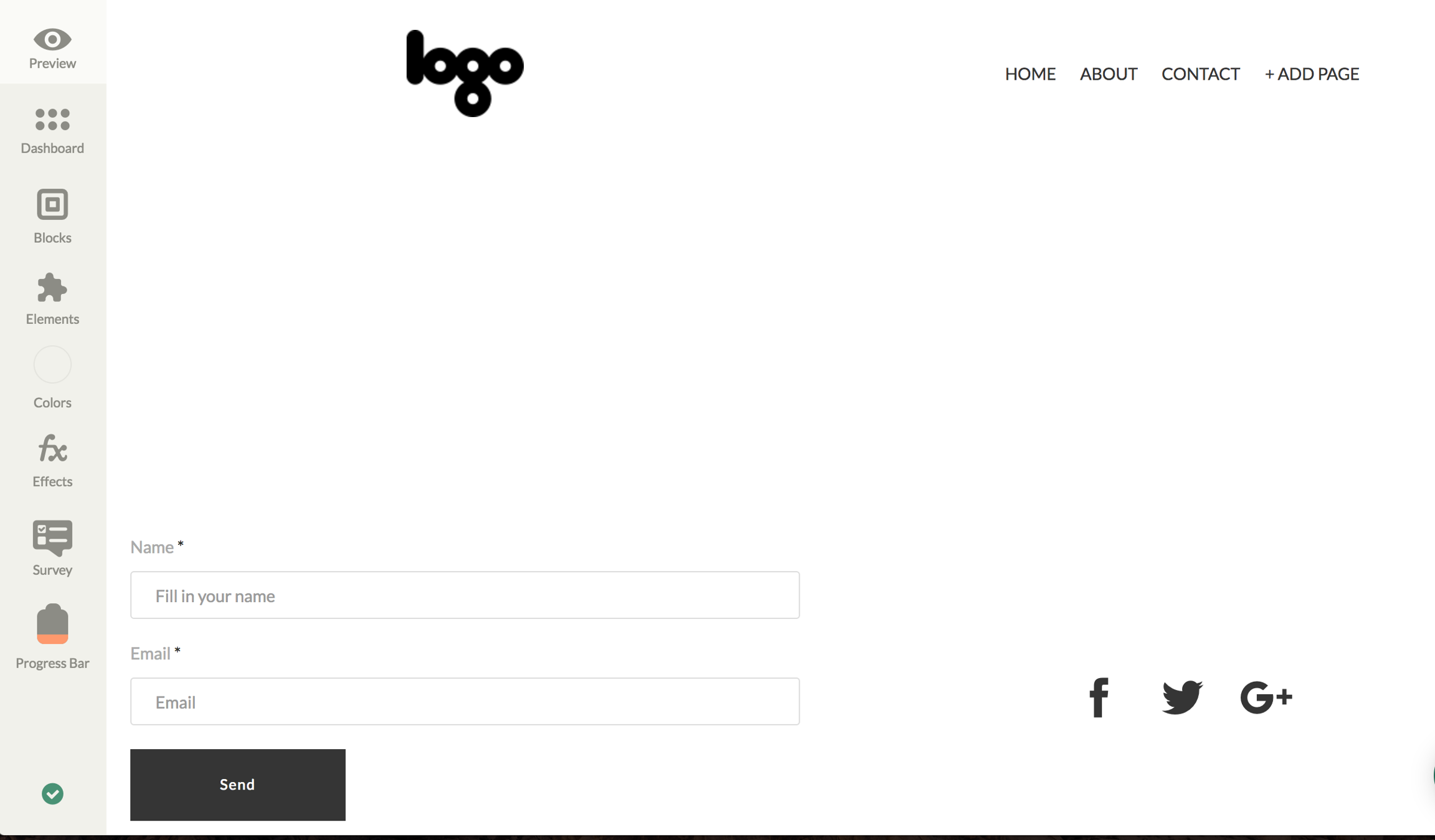
Please note, that both blocks are fixed for all the pages on your site and there’s only single Header and single Footer available.
Alternatively, you can also add pre-designed blocks from Blocks section. Just choose the Block type and drag and drop it on your Header or Footer area.
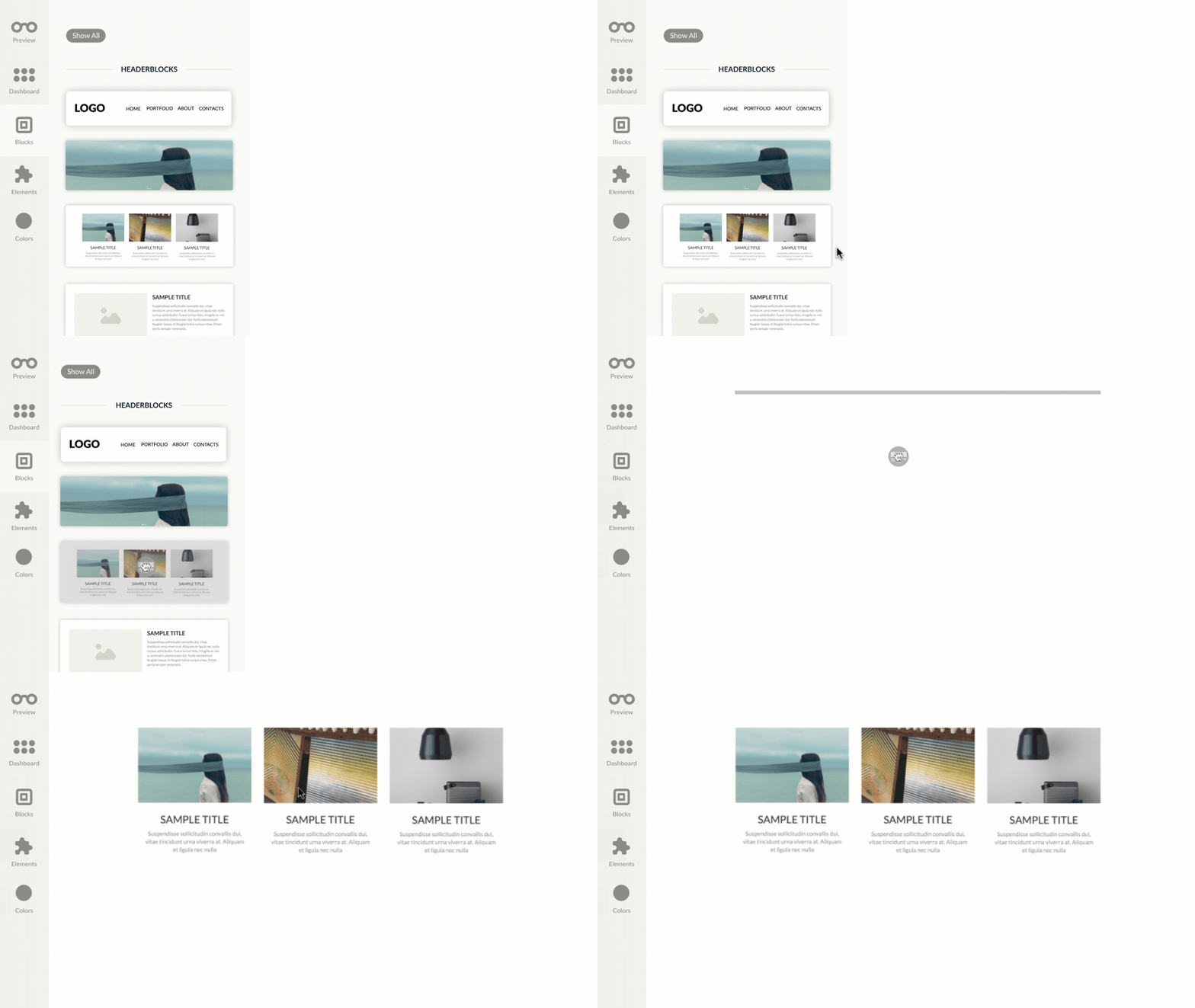
The width for the given blocks is fixed but once you’ve used a certain block, you can change its width just the way you prefer using the pointer.
Pages element, mainly used for setting the site's navigation bar in the header, automatically reverts to the burger layout on mobile view, but only if it's included in the site's header
Last updated