Create Different Versions of Your Website for Mobile, Tablet and Desktop Views
Whether you prefer your Tablet and Mobile versions to mirror your Desktop version or not, styling your site for every view is a top priority!
All the Harness templates are created with responsive design in mind, so they easily adapt to different screen sizes and look good on any device, but you can always build separate versions of your website via Tablet and Mobile Edit Modes.
Mobile Version
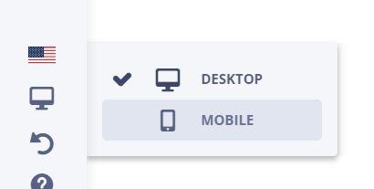
Since you only edit your website while in the Desktop version, go to the Left Panel to switch the edit version to Mobile. Located on the Left Panel is the Monitor Icon. Click on this icon to choose the version you'd like to edit: Desktop or Mobile.

Keep in mind that all the changes made in the desktop version of your site will be applied to the mobile version as well. However, if you add any Elements on the Mobile version, the changes will only be applied to the mobile version.
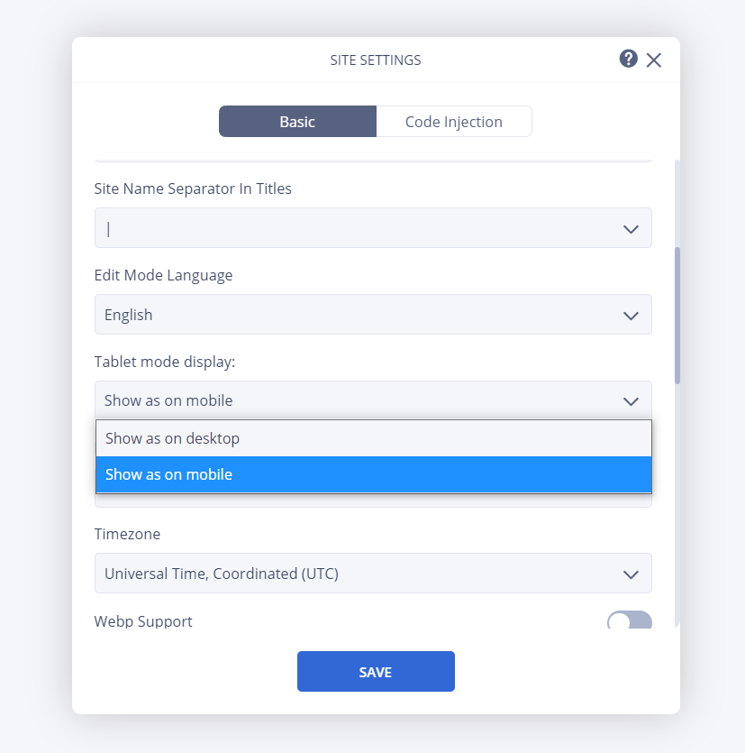
As for the Tablet, you can choose the option of generating the view either from the desktop or mobile versions in the Site Settings App.

The Harness blocks and elements can adapt to any device. To simultaneously delete an element from all the edit modes, you'll need to delete it from the version where it was first created.
Edit Your Mobile Version
Distance between Blocks and Elements
Change the distance between blocks/elements for your mobile version.
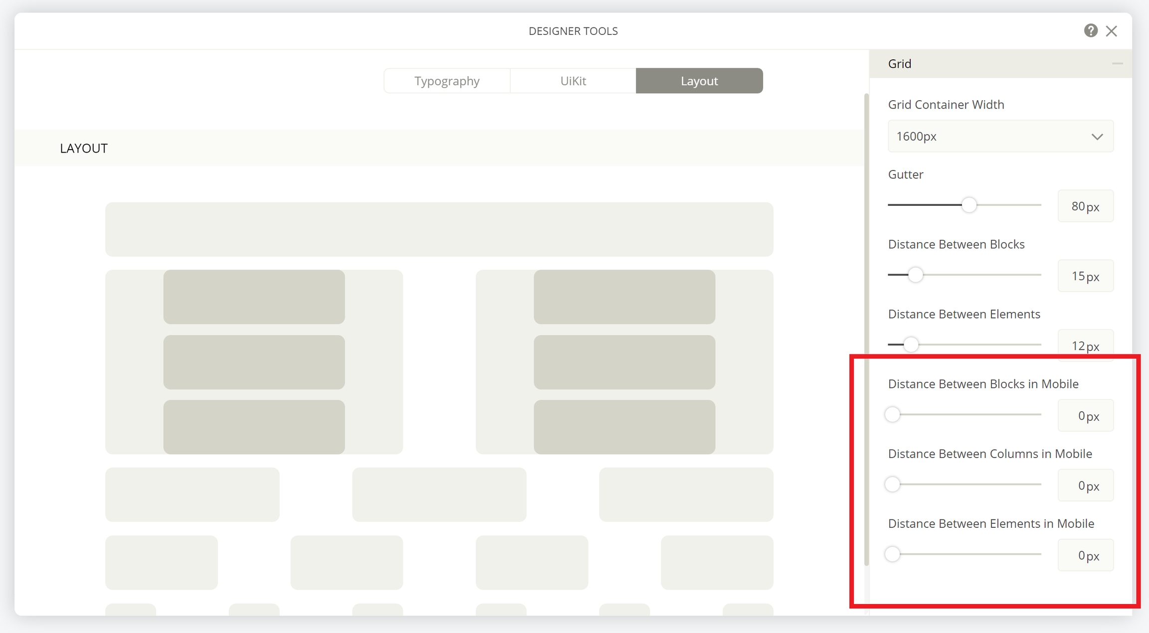
1. Go to your site's Edit Mode. 2. Head over to your Dashboard. 3. Click on the Designer Tools app. 4. Go to the Layout section and edit the distances located on the menu found on the right side.
You can edit the pixel number for the: Grid Container Width, Gutter, Distance Between Blocks, Distance Between Elements, Distance Between Blocks in Mobile, Distance Between Columns in Mobile, and Distance Between Elements in Mobile.

Customize Blocks
Duplicate Blocks and Elements
You can also customize your blocks/elements by duplicating them. Then, change the device visibility and edit away! This way you can have the same block/element, but one is created for the desktop version, while the other is for the tablet/mobile version.
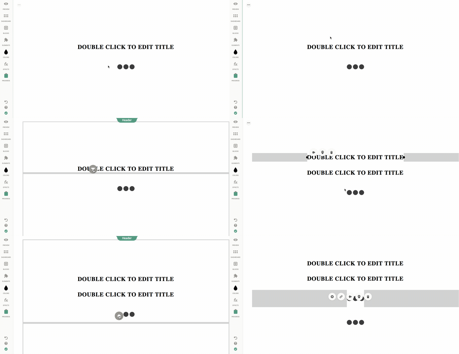
1. Duplicate your elements/blocks by holding down the Ctrl or Command button located on your keyboard, while simultaneously dragging and dropping it to the desired position.

2. Change the visibility settings of your original block/element by clicking Visibility Settings → Device Visibility → select Desktop only. 3. Head over to the Monitor Icon and switch your version to Mobile. 4. Then change the visibility settings of your Mobile block/element by clicking on Visibility Settings → Device Visibility → select Mobile only.
Last updated